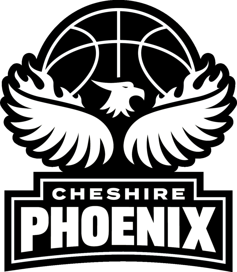
Over the summer we teamed up with Tom Woollam at Redefine Studio to create a new brand for the Cheshire Phoenix. We felt that it was the right time for a change and we acknowledged that by reconstructing our logo we would modernize the club’s look whilst also reinforcing our identity. We believe that this will help us elevate our brand and stature within British sport.
Today, we are absolutely delighted to unveil our brand new logo, which will be used by all of our teams (Men’s, Juniors and Wheelchair) across all of our merchendise and media channels.
James Brice, General Manager of the Cheshire Phoenix declared: “Changing the logo is something that we have spoken about on numerous occasions over the past couple of years. We felt that this was the right time to go ahead and do it. We want to say a huge thank you to Tom and the entire team at Redefine Studio for all the hard work and effort that they have put into revamping our brand. We are excited about the new look and we hope that all of our fans are just as thrilled!”
Tom Woollam, Brand Designer & Founder of Redefine Studio added: “We began talks in early March about how we could help the club elevate their marketing activity. Early on, it was clear that the brand wasn’t the driving force for the club. We discussed our shared passion for basketball, the devoted #NixNation fanbase, the structure of the BBL and how each team is a self-sufficient entity. I strongly recommended repositioning the club to help them achieve their goal of ‘putting British basketball on the map.’
“I’m hoping this will empower the club with a renewed outlook on the upcoming season and give fans something to get truly excited about.”
Read the full case study and blog post by Redefine Studio and Georgia Greenwood.